
What is Pareto Analysis
Pareto Analysis (also referred to as Pareto Chart or Pareto Diagram) is one of the Seven Basic Quality Tools[1] for process improvement.
These seven basic tools form the fixed set of visual exercises most helpful in troubleshooting issues related to quality. They are called “basic” because they require little formal training in statistics and can effectively address most quality-related problems.
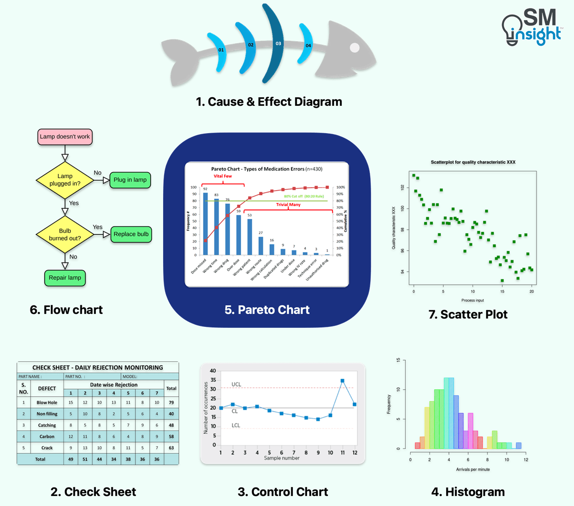
This article will focus comprehensively on the Pareto Analysis, its origin, how a Pareto Chart is constructed and its relevance in modern-day problem-solving.
Origin of Pareto Analysis
Pareto Analysis traces its roots to the Pareto Principle, first observed by the Italian sociologist and economist Vilfredo Pareto.[2] While studying income distribution across Italy in 1986, Vilfredo showed that 80% of income in the country was owned by 20% of the population.
Vilfredo’s work was extended by Joseph Juran[3], an American engineer and well-known quality management advocate.
Juran theorized that losses are never uniformly distributed over the quality characteristics. Rather they are always maldistributed in such a way that a small percentage of the quality characteristics always contributes a high percentage of the quality loss.
This forms the basis of the Pareto Principle, which, in simple words, means “for many outcomes, roughly 80% of consequences come from 20% of causes”.
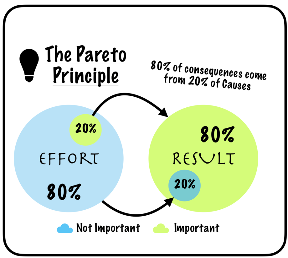
This principle is also known as The 80/20 Rule (most common), The Law of the Vital Few or The Principle of Factor Sparsity, which all interchangeably mean the same.
It is important to note that although many systems tend to follow an approximate 80-20 pattern, this is not an absolute or obligatory rule. The distribution can vary, such as 90-10 or 70-30, while still adhering to the underlying principle that many outcomes are a result of a few causes.
Why use Pareto Analysis?
Organizations have diverse goals and aspirations but in most cases, are constrained by resources (money, manpower, machines, technology etc.).
Under such limitations, Pareto Analysis can help create maximum impact with the least amount of effort. This enables teams to work more efficiently on specific initiatives. Targets can be achieved faster simply by prioritizing initiatives in the right order.
Other benefits include:
- Setting clear priorities for the organization
- Increased daily productivity
- Ability to portion work into manageable segments
- Focused strategy
Pareto Analysis optimizes the overall organization’s performance by pointing to the highest return activities that can be pursued for maximum benefits.
When to use a Pareto Analysis?
The most compelling use case of a Pareto Analysis is to optimize the utilization of an organization’s resources by focusing them on a few key areas rather than spreading them over many others that have little impact on results.
Pareto Analysis helps identify patterns that highlight the main reasons behind most of the challenges an organization is trying to solve.
But, to perform a Pareto Analysis, the process data must fulfill two criteria:
1) It must be possible to arrangeable the data into categories
The core part of the analysis involves breaking down complex issues into their constituent root causes so that the repeating causes can be prioritized according to the number of occurrences.
For example, if an automobile assembly manager wants to analyze failures in the production line, it must be possible to classify them into categories such as equipment failures, material shortages, worker absenteeism, and quality defects.
Without this classification, it will not be possible to prioritize one category over another.
2) The ranking of the categories should matter
If the ranking of categories does not matter, the data frequency is no longer relevant for decision-making.
For example, if the assembly line manager determines that addressing the top two categories, equipment-related issues, and material-related issues, will have the most significant impact on reducing delays, the exact frequency difference between these two categories becomes less important. The focus is on resolving both categories as they are the primary contributors to the delays.
In this case, the data frequency becomes less relevant because the primary goal is to address the critical categories and minimize their impact, regardless of the precise order between them.
A Pareto Analysis will not add value in such a case.
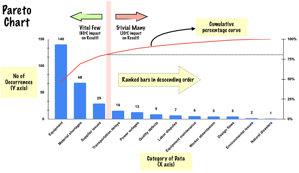
Components of a Pareto Chart
A Pareto Chart is a combination of a bar graph and a line graph. It consists of four major components:
| X-Axis | The category of data is plotted along the X-axis. In the below example, the categories are the causes of delay in an assembly line manufacturing setup. |
| Y-Axis | Occurrences of each of the categories are plotted along Y-axis. This represents the number of recorded cases where a particular cause led to the delay. |
| Ranked bars arranged in descending order | The height of the bar represents the frequency of occurrence of a particular category. These bars must be arranged in descending order. |
| Cumulative percentage curve | Shows the cumulative percentage (on the y-axis) while traversing the categories from left to right. A secondary Y-axis with a 0 to 100% scale is used to plot the cumulative line graph. |
Constructing a Pareto Chart
To demonstrate the components and process of building a Pareto diagram, consider the example of a company that is facing delays in shipping products due to various problems in its production line.
The company has limited resources to spare and cannot focus on all the root causes. It must judiciously allot resources (manpower, management attention, funds etc.) such that chances of on-time delivery are maximized.
By performing a Pareto Analysis, the resulting Pareto Chart can help the company make the best use of its resources. The process involves the following steps:
Step 1 – Decide on the categories
Categories are the list of causes/events that contribute to a problem being addressed. This could be gathered through feedback from employees, clients, or customers.
It is important that the list of causes identified accurately reflect the issue. An analytical approach to preparing a root cause list could be by using a Five-Whys analysis.
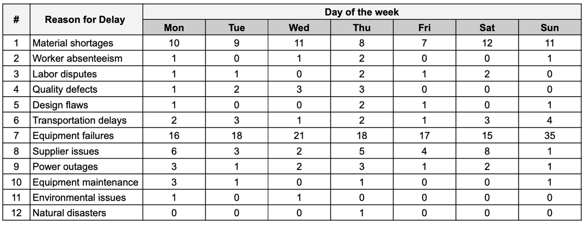
In the case of the example considered, the company has identified a total of 12 causes that have led to the delays, which are:
| (1) Equipment failures | (7) Labor disputes |
| (2) Material shortages | (8) Design flaws |
| (3) Worker absenteeism | (9) Supplier issues |
| (4) Quality defects | (10) Equipment maintenance |
| (5) Power outages | (11) Natural disasters |
| (6) Transportation delays | (12) Environmental issues |
Step 2 – Establish a measurement metric
The next step is to identify a measurement metric that is most appropriate to the grouped categories.
These could range from the number of product defects per batch to the frequency of customer complaints, to how many resources it takes to manufacture a product to how long it takes to resolve customer complaints, etc.
In the case of the above example, the number of times a particular root cause was responsible for the delay is a good metric to consider.
Step 3 – Choose a timeframe to collect the data
This can be one work cycle, a sprint, one full day, one week, one month etc. In the case of the example, the company has chosen to record one week’s data.
It is important to choose a sufficiently broad timeframe to even out the impact of rare events and aberrations. For example, in the example’s case, if a day was selected instead of a week, it may not accurately capture the trends in material shortages or transportation delays. This could lead to misleading results.
Step 4 – Record the data over the selected timeline
Gather data on the number of times each chosen category was responsible for the delay. The measurement metric in this example case is the frequency, which was selected in Step-2. It could vary depending on the choice.
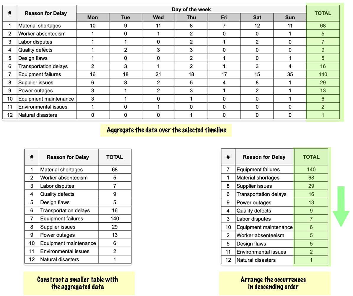
The recorded data must then be organized in a table according to the categories and timelines selected. In the case of the company’s example, the selected timeline is one week with 12 categories. Hence, the data tabulation will look as below:
Step 5 – Organize the data
The output of this step is a table with categories sorted in descending order as per their occurrence over the selected period.
In the example case considered, the steps would involve aggregating the occurrences by adding totals to each category, constructing a smaller table (or hiding the daily data) and then sorting the data in descending order based on occurrences of each root cause.
The same is shown in the figure below:
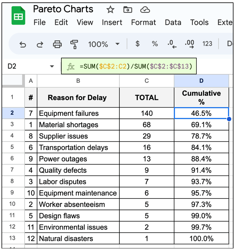
Step 6 – Calculate cumulative percentages
Cumulative percentages can be calculated using any of the spreadsheet applications. In the figure below, cumulative percentages are calculated for the example case using Google Sheets. The formula used can be seen in the image.
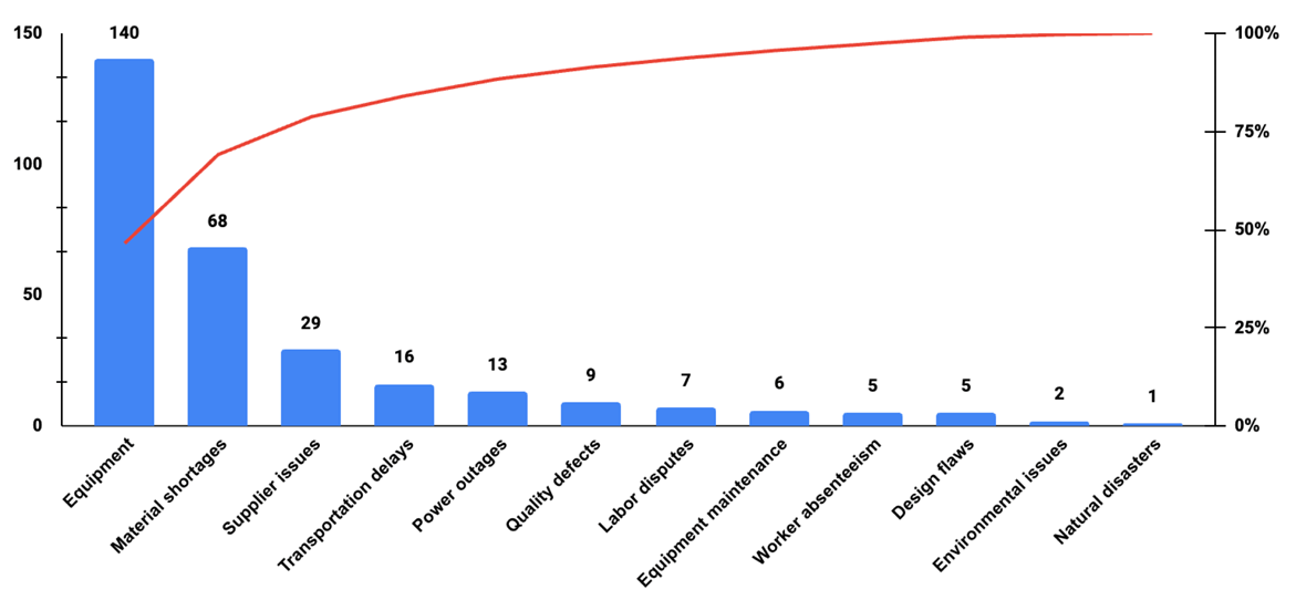
Step 7 – Construct the graph
This step involves graphing the data. A spreadsheet tool can be conveniently used to plot a bar graph (occurrences) and a line graph (commutive percentage).
In Google Sheets, this can be performed using a Combo Chart[4], with achieves both objectives with the following steps:
- Select the data in the table
- Go to Insert -> Chart
- From the Chat Editor, change the chart type to Combo Chart[4]
- Set X-axis data as a category – In the example case “Reason for Delay”
- Set left Y-axis data as the frequency of occurrence – In the example case “Reason for Delay”
- Set the right Y-axis data as the cumulative percentage
With this, the Pareto chart will be ready and will look as under:
Interpreting a Pareto Chart
Once a Pareto Chart is constructed, clarity emerges on which few out of the many occurrences have the most impact on the results.
The Cumulative percentage curve makes it easier to visually answer the question – “Which 20% of the causes are responsible for 80% of the results?”
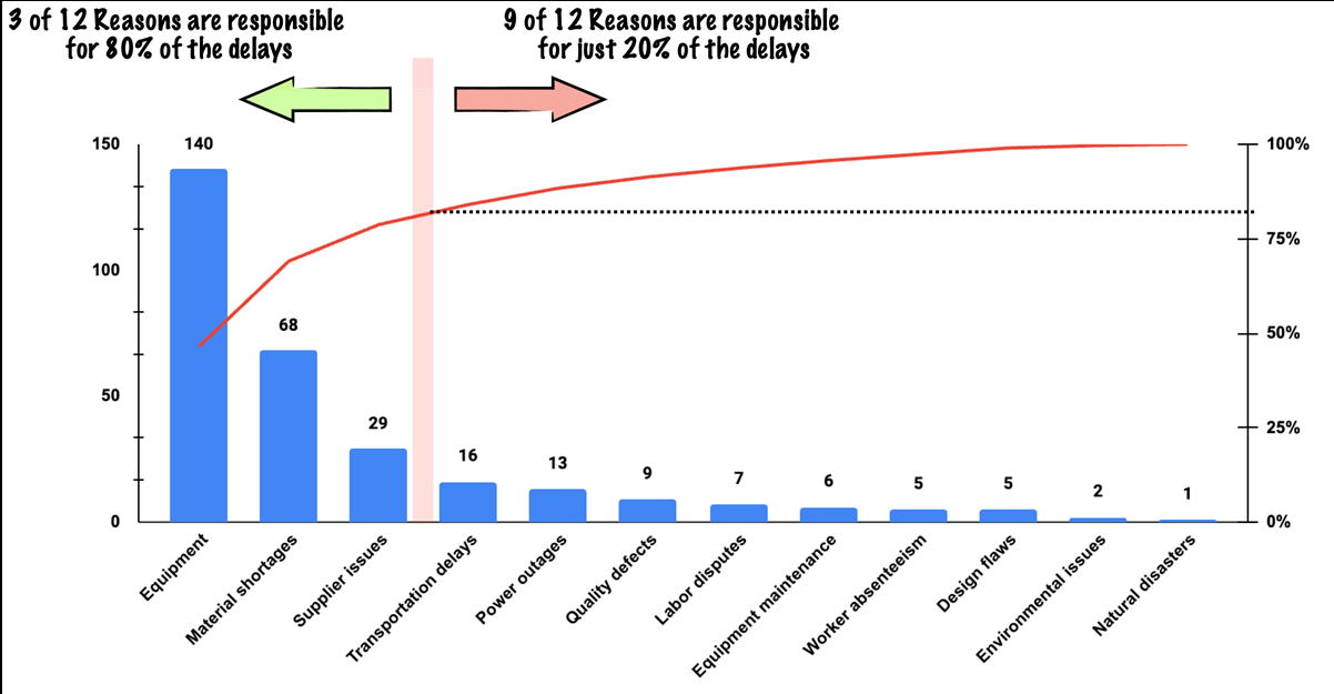
It can be seen from the example case chart above that out of 12 identified causes, just 3 contribute to over 80% of the delays.
With this, the company has a clearer picture of where to focus its efforts and deploy resources.
Limitations of Pareto Analysis
Although Pareto Analysis is a potent visual problem-solving tool, it does have certain limitations, such as:
Data quality – if the data is compromised by errors, inconsistencies, biases, or missing values, results can be misleading or inaccurate, leading to wrong decisions.
Root cause analysis: Pareto analysis helps to identify the frequency and impact of different causes of a problem, but it does not provide any insight into the underlying reasons or mechanisms behind them.
For example, a Pareto chart may show that half of all problems occur in shipping and receiving, but it does not explain why that is the case. To find out the root causes, additional tools such as the 5 Whys or Fishbone diagrams are needed.
Qualitative aspects: Pareto analysis focuses on quantitative data, such as the number of occurrences or the percentage of the impact of different causes. However, it does not account for qualitative aspects, such as the severity, urgency, or complexity of the causes.
For example, a Pareto chart may show that equipment failures are the most frequent cause of delays, but it does not indicate how severe or difficult to fix those failures are. Qualitative aspects may affect the priority and feasibility of addressing different causes.
Future scenarios: Pareto analysis is based on past or present data, which may not reflect future scenarios or changes in parameters.
For example, a Pareto chart may show that supplier issues are a minor cause of delays, but that may change if the supplier changes its policies or prices. Pareto analysis does not account for uncertainty or variability in the data or the environment. Therefore, it should be updated regularly and supplemented with other tools such as scenario analysis or risk analysis.
Varied Applications of Pareto Analysis
Pareto Analysis, with its versatile nature, finds applications across diverse industries and sectors. It aids in identifying critical issues, prioritizing tasks, and allocating resources effectively.
Some examples use cases of Pareto Analysis are:
| Manufacturing | Identifying major quality issues in production |
| Retail | Determining the most frequent customer complaints |
| Healthcare | Identifying the main causes of patient safety incidents |
| Logistics | Analysing the key factors leading to delivery delays |
| Banking | Identifying the most common sources of customer complaints |
| Software | Identifying the top software bugs affecting users |
| Hospitality | Determining the primary reasons for guest dissatisfaction |
| Construction | Analysing the main causes of project delays |
| Telecommunications | Identifying the major reasons for service outages |
| Energy | Determining the primary sources of equipment failures |
| Agriculture | Identifying the main factors affecting crop yield |
| Transportation | Analysing the primary causes of accidents or breakdowns |
| Education | Identifying the major obstacles to student learning outcomes |
| Insurance | Determining the most common causes of claim denials |
| Food Industry | Identifying the main sources of product contamination |
Pareto Analysis can even be applied at an individual level to identify the vital few factors that significantly impact personal productivity, thus aiding in effective time management, focused improvements, and better decision-making.
Sources
1. “THE 7 BASIC QUALITY TOOLS FOR PROCESS IMPROVEMENT”. American Society for Quality (ASQ) , https://asq.org/quality-resources/seven-basic-quality-tools. Accessed 29 Jun 2023
2. “Vilfredo Pareto”. Britannica, https://www.britannica.com/biography/Vilfredo-Pareto#ref37223. Accessed 01 Jul 2023
3. ” Dr. Joseph M. Juran”. Juran.com, https://www.juran.com/about-us/dr-jurans-history/. Accessed 01 Jul 2023
4. “Combo chart”. Google, https://support.google.com/docs/answer/9142593?sjid=5335603720602667500-AP#combo_chart&zippy=%2Ccombo-chart. Accessed 30 Jun 2023